Episode 3: Drafting Time
Having considered the Grand Design in the previous episode, it's time for a serious mockup to get the little details sorted.
At the (virtual) drawing table …
Traditionally, we'd use pencil and paper for this, even better, if we have some quadrille paper at hand. To save a few happy little trees, I'm rather using Photoshop to arrange all those pixels into a viable mockup of the application. Anyway, this should help approaching some of the details.
Player's Perspective
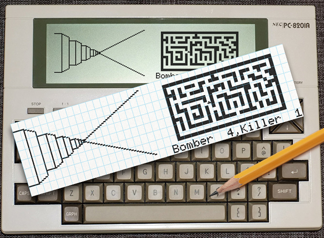
Let's have a look at the first-person view first. I'd want to keep this simple and just use an orthogonal 3D projection (without any narrowing in the distance), but this just doesn't work. So we'll go for some real perspective, using a slope of 2 for lines stretching into the distance and a narrowing distance between vertical lines, as they are farer and farer away. We start with a horizontal wall width of 9 pixels and decrease this by 1 for every level of depth. This will give us a depth of field of about 9 units. (This is, if our realtime performance can keep up with this.)
The good news is that we'll use less than half of the screen for this, even if we keep this large and wide — still enough screen estate left for a nice on-screen map.
The bad news is that we won't go with traditional printing at all (even for the NEC PC-8201A). This may need more character definitions than we have space for, so we'll go for directly transferring bit vectors for any column of 8 vertical pixels to the display drivers for all of the machines. This way, we also save some incrementing addresses over a character width of 6 pixels each time, but we'll also have to invest more into the drawing logic.
Mockup of the screen display.
The perpective view demos alternating walls and passages on the left and a continuous wall at the right.
The maze layout and map are faithful to the original with a single line of status display below.
("Bomber" and "Killer" are apparently the canonical players' names.)
The Maze Map
The even better news is that we'll keep the original maze layout, in all its glory. Walls and passages are displayed at equal widths, just as with the original 1970s games. The positional player marker will be just a little triangle, but this will do for our purpose. The grid will be made of 3 × 3 pixels units and extend to 18 rows @ 32 columns thus occupying a space of 16 × 6 characters. As we move this away from the absolute top by some pixels, we use 7 lines for this, with an extra row left for the status display.
Technically, we'll draw the maze once and fix up the player marker on the fly — it's just 4 pixels — probably using PSET / PRESET.
Status Display
With just a single line, there isn't much room left for the status display. It's true that our map requires just 6 rows of the LCD, but characters are drawn starting at the very top of the 8 × 6 pixel matrix (with the vertical leading at the bottom), and we'll need some separating pixels between the map and the status display. (We could put 2 lines onto the top, but I really want this at the bottom of the maze, just like the Xerox Alto version.)
With just a single line of spare screen estate to display any informations, we'll have to keep this really old school: 6 characters each for players' names and 2 digits of score display. For all practical purpose this should be sufficient, just as it was in the old days.
*****
Having arrived at a viable mockup and sorted out some more details of our specs, it's time for the drawing algorithm next time.
— Stay tuned! —
▶ Next: Episode 4: LCD Talk
◀ Previous: Episode 2: Soft Considerations
▲ Back to the index.
2016-01-10, Vienna, Austria
www.masswerk.at – contact me.
— This series is part of Retrochallenge 2016/01. —