Another view at Minard’s famous flow map, AKA “the greatest infographic of all times”
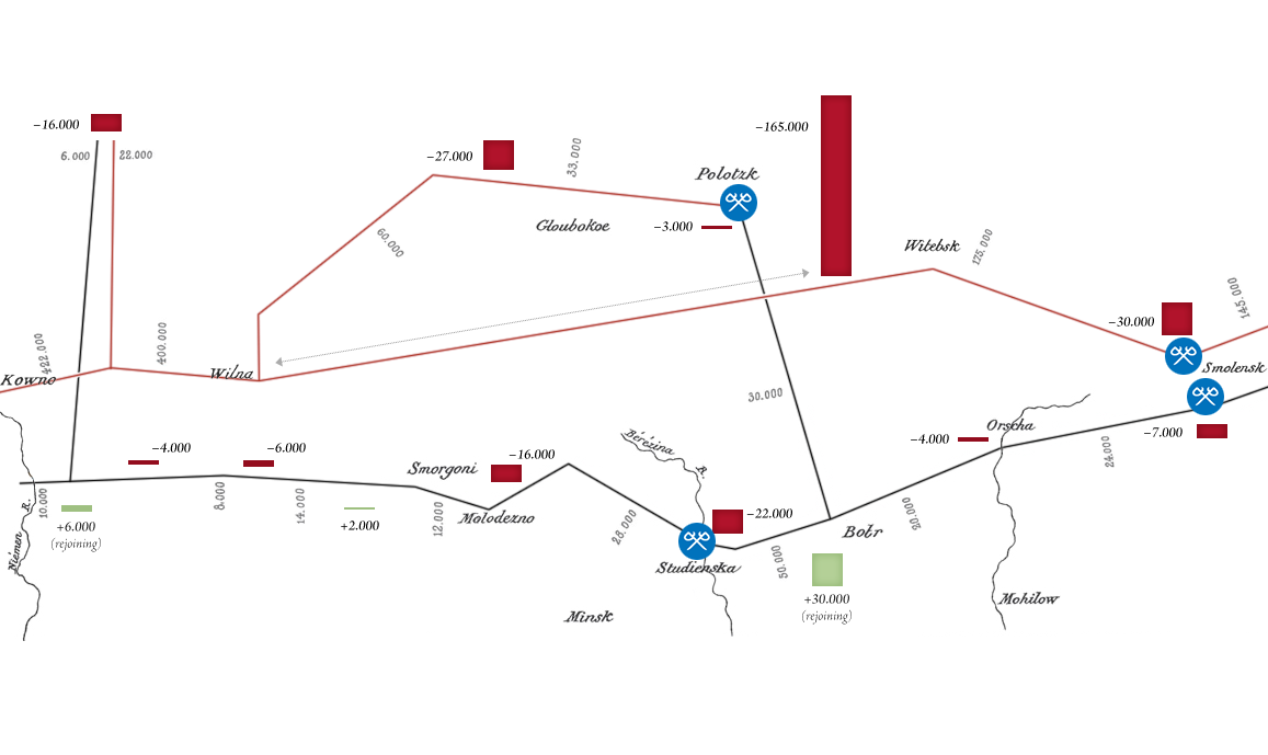
Remapping Minard’s map.
Much has been said about Charles Joseph Minard’s famous flow map titled “Carte Figurative des pertes succesives en hommes de l’Armée Française dans la campagne de Russie 1812-1813” (Paris, 1869) and it is universally praised for its comprehensive depiction of an impressive variety of quantitative data, hence there shouldn’t be much left to add to this. However, as indicated in a previous post, “Observing Minard Observing Napoléon – Observations on textual strategy in infographics by the example of the ‘Greatest Infographic of All Times’.” (2018), Minard’s map may not be what it seems to be at first glance. While we concentrated in this first post mainly on the aesthetic choices and what is actually shown and not shown in the chart and the general context of that sheet, both in presentation and history, we are here going to have a closer look at the very choice of presentation, namely the choice of a flow map and the implications thereof.
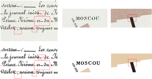
Observations on information spread and authenticity of well-known objects on the Internet. (Also, a visual whodunit. And a new reference image.)
When I was recently reviewing various versions of image files representing Charles Joseph Minard’s famous chart of Napoleon’s Russian Campaign of 1812-1813 from 1869 for my discussion of the subject (see below), I noticed something peculiar: While there are various scans of the graphic available on the Web, in varying resolution and compression quality, almost all of them seem to depict a single, uniform object. However, there are just a few exceptions. Notably, these exception differ in the weight of the black print, especially the stroke widths of any black lines and by this the overall balance, and color. Most notably, these few exceptions can be traced back to just two authentic sources, both official image from French libraries. Something peculiar seems to be going here. — Time to investigate…
Observations on textual strategy in infographics by the example of the “Greatest Infographic of All Times”.
In November 1869, at age 88, a year short before his death in October 1870, Charles Joseph Minard published a sheet with two graphs, one of them titled “Carte Figurative des pertes succesives en hommes de l’Armée Française dans la campagne de Russie 1812-1813”, commonly known as “Napoleon‘s March on Moscow”. It is this final work of the French master of statistics and visualization, which survived in collective memory still to the present day, about 150 years later, which is probably much like it was intended by its author. Thanks to authorities of the field, like Howard Wainer and Edward Tufte, who suggested that this “may be well the best graphic ever produced”, Minard’s March on Moscow enjoys an even inreasing popularity, with Tufte’s careful suggestion soon becoming the trope of “the greatest infographic of all times”. — But, is it?