Observing Minard Observing Napoléon
Observations on textual strategy in infographics by the example of the “Greatest Infographic of All Times”.
In November 1869, at age 88, a year short before his death in October 1870, Charles Joseph Minard published a sheet with two graphs, one of them titled “Carte Figurative des pertes succesives en hommes de l’Armée Française dans la campagne de Russie 1812-1813”, commonly known as “Napoleon‘s March on Moscow”. It is this final work of the French master of statistics and visualization, which survived in collective memory still to the present day, about 150 years later, which is probably much like it was intended by its author. Thanks to authorities of the field, like Howard Wainer (Visual Revelations – Graphical Tales of Fate and Deception from Napoleon Bonaparte to Ross Perot. Copernicus, 1997) and Edward Tufte (The Visual Display of Quantitative Information. Graphics Press, 1983; 2nd ed. 2001), who suggested that this “may be well the best graphic ever produced”, Minard’s March on Moscow enjoys an even increasing popularity, with Tufte’s careful suggestion soon becoming the trope of “the greatest infographic of all times”. — But, is it?
While commonly praised, Minard’s masterly work has been placed under some substantial scrutiny, as well, as others, like Michael Friendly (Visions and Re-Visions of Charles Joseph Minard. In: Journal of Educatiational and Behavioral Statistics, Spring 2002, Vol. 27, No. 1, pp. 31-51) have proposed revisions (implying at least the possibility of improvement), or have even, like Nicholas Jenkins, criticized Minard’s graphic for observable deficiencies. — So, is it rather Minard’s historic failure, just like the epic campaign it depicts? Does it actually deserve the recognition, it universally enjoys?
Let’s find out.
BTW, you may want to experience the graphic in this interactive implementation, meant to add some dynamics — and by this, time — to the reading of Minard’s chart, which I did a few years ago as a demonstration piece for the purpose of teaching.
1) Classical Reading
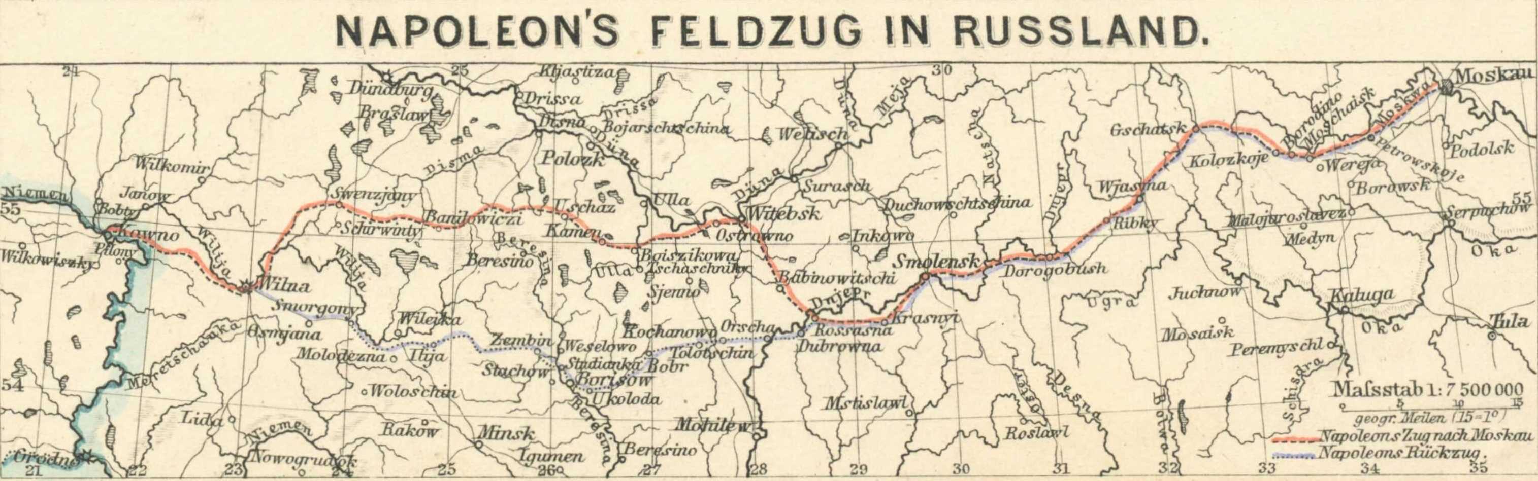
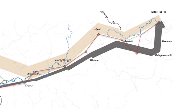
Let’s have a closer look at Minard’s Russian Campaign map as it is meant to be looked at, here reconstructed in its original, reddish tint, which has faded to ocher-beige since:
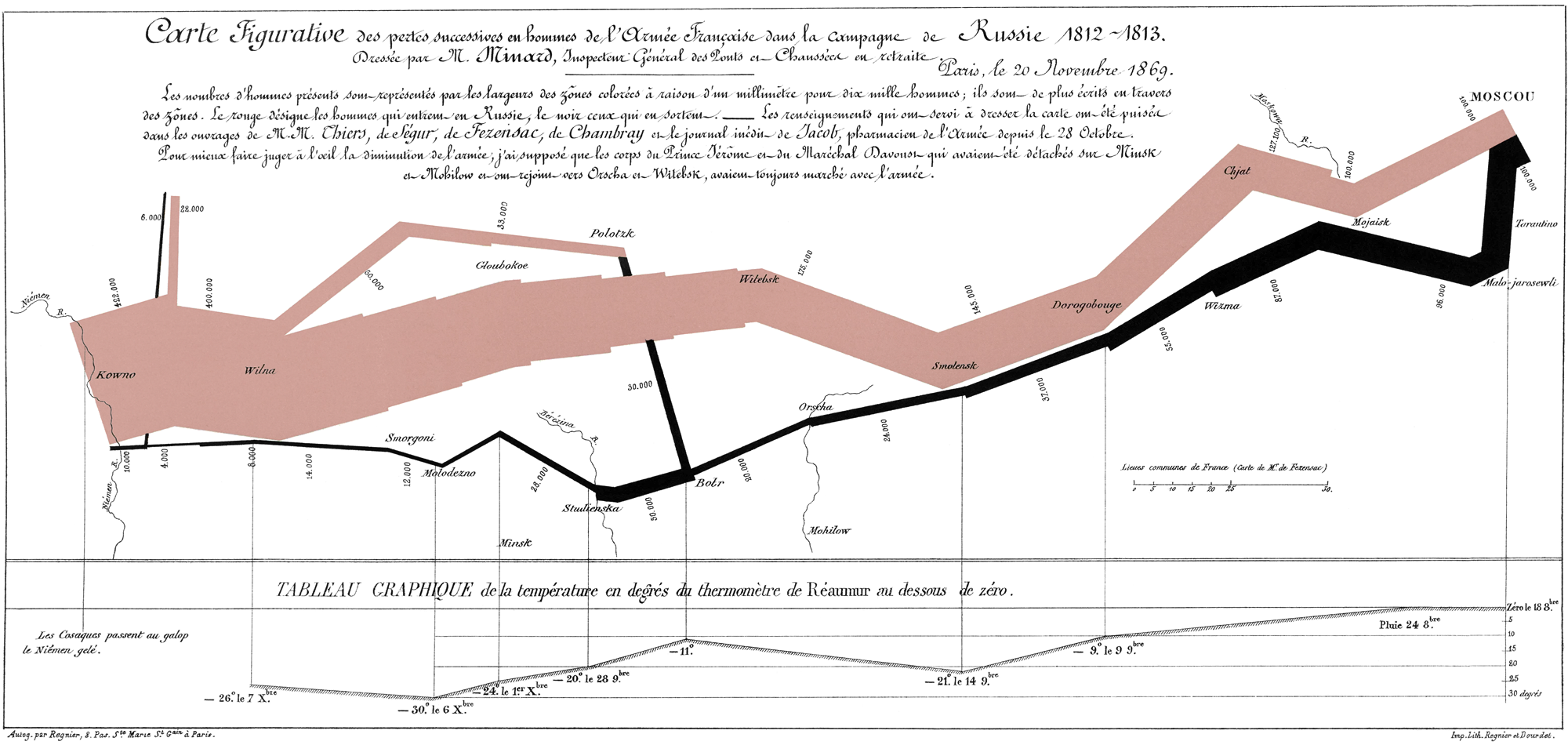
Charles Joseph Minard: “Carte Figurative des pertes succesives en hommes de l’Armée Française dans la campagne de Russie 1812-1813”, Paris, 1869. 62 × 30 cm, ca. (newly edited; N.L.)Image source: École nationale des ponts et chaussées, Fol. 10975, Bibliothèque numérique patrimoniale des ponts et chaussées. · Click for a larger image (2,000 × 950 px).
(Note: The map as available on Wikipedia seems to be rather the redrawing by Elaine Morse than a cleaned version of the original as indicated by weights and stroke thicknesses of the black print. See this article for a closer discussion. The image presented here is an entirely new digital copy, representing a cleaned aspect of the original sheet. The color has been adjusted according to examples of similar tints used by Minard which may be considered “red” and seem to fairly match the copy at the École nationale des ponts et chaussées.)
Ingredients
The chart consists of three primary segments,
- A heading title and description, which properly provides sources and explanations regarding special approaches that regulate the particular visualization,
- The central visualization, consisting of two connected graphs, one showing the Grande Armée’s march on Moscow (in red) and one showing the retreat (in black),
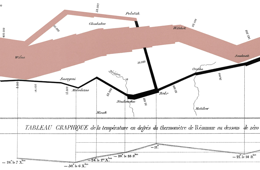
- A tableau giving date, temperature and weather conditions for selected data points of the retreat.
Title and description read as follows (my translation; I generally prefer translations which are rather close to the original wording for purposes like this):
Figurative Map of the successive losses in men of the French Army in the Russian campaign 1812-1813.
Drawn by Mr. Minard, Inspector General of Bridges and Roads in retirement.
Paris, 20 November 1869.
––––––––––––––––––––––
The numbers of men present are represented by the widths of the colored zones in a rate of one millimeter for ten thousand men; these are also written beside the zones. Red designates men moving into Russia, black those on retreat. — The informations used for drawing the map were taken from the works of Messrs. Chiers, de Ségur, de Fezensac, de Chambray and the unpublished diary of Jacob, pharmacist of the Army since 28 October.
In order to facilitate the judgement of the eye regarding the diminution of the army, I supposed that the troops under Prince Jèrôme and under Marshal Davoust, who were sent to Minsk and Mohilow (Mogilev) and who rejoined near Orsha and Vitebsk, had always marched with the army.
The central part depicts the story of the Grande Armée of Imperial France, the largest army of its time, entering Russian territory with 422,000 men (modern sources give somewhat higher numbers in the 450s or even 480s of thousands) on the 24th of November 1812, in order to find its doom. When arrived at Moscow, only 100,000 or 23.7 % out of the original 422,000 men were still alive, eventually diminishing to a miserable rest of 10,000 (2,37 %, or 10 % of those still alive at Moscow), when leaving Russia on December 14.
None of the dates are provided directly in the graphic, which heavily relies on the common knowledge of the general events, which were, 57 years after the event, subject to both national pride and lament and well known by the intended audiences. Instead, it painstakingly depicts the loss of men in a scale of 1 millimeter to every 10,000 men in the marching order as the army traverses the western part of the Russian Empire, there and back. It is also this constant scale, which binds the two parts, while separated by color, into a single movement, which is the doom of those participating in the invasion. The respective strength is annotated in small figures, commonly found attributed to the individual legs of the march.
Besides these numbers, the graph is annotated sparsely, just some disperse names of locations for geographical orientation (also meaningful for the historic events) and a (partial) depiction of four rivers.
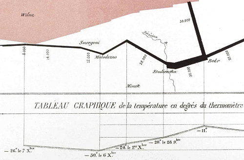
Image source (edited, N.L.): idalab.de.
However, additional data is provided in the tableau of dates and temperatures, which associates its data points directly to certain points of the returning movement in the central graph by thin, vertical lines. Temperatures are given in the now somewhat obscure Rèaumur scale, dates range from the 18th of October to the 7th of December. (Months are provided in a — to the modern eye — rather peculiar mix of verbal and numerical notation, as in 8bre, 9bre, and, using a Roman figure, Xbre.) Moreover, there is a single annotation for rain on October 24 (“Pluie 24. 8bre”), thus transcending the purpose of a mere temperature chart.
Additionally to this, we find a single anecdotal reference to the very beginning of the march, which is also relevant for general meteorological conditions, namely, “The Cossacks are galloping across the frozen Niemen.” (”Les Cosaques passent au galop le Niémen gelé.”)
Finally, below the bounding frame, we find references to the autographer and the printer, who observed the lithography and the reproduction.
Besides, there’s also a unit scale at the bottom right of the main graph, provided in lieues communes (or lieue de terre), translating to about 4.445 km or 2.762 miles per lieu. This scale gives also a reference to a map this representation is based on, namely a map by Mr. de Fezensac, who is also named in the description. (Particularly, this is a map by Raimond de Montesquiou-Fézensac titled
Aesthetics
We may note that, while the prime red color of the invading motion may attract more attention than the black, returning motion of the retreat, it is particularly the retreat which is pointed out by the associated tableau, for this becoming the apparent topic of the plate. However, it is also thanks to this additional, detailed data being available for the retreat only, which allows the observer to switch in dimensions and complexity of the graph, by either reducing the information to what is conveyed by the central section exclusively or including the additional data of the tableau.
Moreover, we may observe that there are exactly 9 points, which give in connection the path of the march on Moscow and that there are also exactly 9 data points for the temperature chart. Since the individual data points of the latter are also connected by the lines of a linear interpolation, the graph formed by these data points roughly echoes the motion of the eastbound motion of the main graph in a pleasing manner. In-between, bracketed by the more substantial red part of the graph and the thin lines of the rhyming temperature graph below, we find the black graph of the retreating motion, which, while directly referred to by the data points of the temperature tableau, consists of about as twice as many interconnected points (17) as any of the two other graphs.
In effect, by associating movement between geographical locations as represented in a Carthesian coordinate system pointing up to represent North and the high and low levels of temperature on a common time axis, what may be read as a story of rise and fall, becomes a decrescendo of doom, when read in reverse order, with the geographical movement of the retreat fitting in in a somewhat contrapuntal manner by its diverging and converging motions, which also binds the two other parts by meaning.
The scansion of the thin vertical lines striking through the lower two sections lends a further sense of rhythm to the presentation, at the same time segmenting the sequential graphs and binding the separate sections like the bars of a partitura. This contrapuntal, rather musical conception of the composition arguably contributes to the often observed seamlessness of the graphic. The pure, clear color tints of red and black without any shadings or halftones and an ample amount of white space match these general aesthetics and add further to an overall classical gestalt, which helps in appreciating the complexity of the presentation (as compared to mannerist aesthetics favoring broken colors and eccentric composition).
Another reason for the “clearity” of the graphic is in the reduction and abstraction, the data has undergone. Rather than depicting the path of the marching army in minute detail, the entire motion is presented in a few, big sweeps, as a grand gesture, which is the gesture of fate. This is also entertained by a finely tuned disproportion of weights, as in the broad, expansive gesture of the central graph and the fine lettering of numbers, location names and the thin, but sure strokes of the selected rivers, which contrast in their meandering and minute detail the straight and weighted strokes representing the marching army. The graphic is by this a study in the comprehensive, comprehensive in the sense of encompassing all the vital information, there is, but also comprehensive as in presenting this in a comprehensible manner.
Quantitative Mapping, Data, and Variables
While these aesthetical qualities are mostly contributing on a subconscious level, there are other, more objective qualities to feast on, which are the very variables encoded by the chart. As there are,
- Geographical location / position in a 2D space (quantitative),
- Direction of movement (quantitative),
- Time, by this also a rough estimate of the speed of this movement (quantitative),
- Strength in men (quantitative),
- Temperature vs. time and 2D position of measurements (quantitative; provided for the retreat only),
- Further weather conditions (nominal scale; as in rain, frozen Niemen),
- Some topographic features (of nominal scale) mapped in 2D space (quantitative), especially river crossings and places of well known historic events.
Plus an additional qualitative variable, an anecdotal remark on the Cossacks galloping across the frozen Niemen. As noted before, the whole variety of data is present only for the retreat, which by this becomes the apparent subject of the chart.
Note: Edward Tufte gives a somewhat different list of variables in his text book (ibidem, p. 40), “Minard’s graphic tells a rich, coherent story with its multivariate data, far more enlightening than just a single number bouncing along over time. Six variables are plotted: the size of the army, its location on a two-dimensional surface, direction of the army’s movement, and temperature on various dates during the retreat from Moscow.”
Praise for Minard’s art of combining and integrating this manifold of data dimensions as properties of a movement in space and time, which continues to amaze its beholders to the present day, is thus common that I may save any further expenditure on this. However, we may note that the number of 6 to 7 variables mapped by the chart perfectly soothes the capacity of the human mind, as in 7 ± 2 chunks of data (3.32 bits) bandwidth of working memory — compare George A. Miller (The Magical Number Seven, Plus or Minus Two) —, in other words, neither too boring nor beyond capacity to be comprehended at once. Notably, there are also 8 legs or lines connecting data points in the top and bottom graph and about 8 broad changes of direction in the middle one, also fitting the rule of 7 ± 2.
2) Beyond Canonical Reading
Undeniably, Minard’s map of the Russian Campaign of 1812 is a great feat and an epic accomplishment. Why may it be open to scrutiny, even to criticism?
One of the issues often observed, is Minard’s reluctance to include any notion of agencies, apart from a few, rather technical mentions in the description. Not even Napoleon’s name appears once on the entire plate. As for the graphical part of the chart, it is void of any historic specifics, opposing forces, or events resulting from this opposition. There’s no explanation provided, apart from the dispersedly scattered names of geographihic locations, which allude to a historical narrative that is essentially excluded from the picture, left to the pre- and context of the particular presentation. It’s just a record of locations, directions, turning points, head-count, temperature and time of measurements, but it’s devoid of anything which would provide any reasons for the meandering movement of the French Army as depicted by the graph.
Compare this interactive version (masswerk.at). · Click to enlarge.
This is especially interesting, since this is still about a map. A map may be considered a tactical device. A map is essentially a projection, not just in the cartographical meaning, but very much so as a projection of potentials based on accumulated knowledge in order to instruct future action. These potentials are in essence tactical ones: Potentials of allocation and traversability, situs and terrain, roads, possible river fords, lines of sight, elevation and gradients, soil texture, vegetation, buildings, general development and accessibility of a given terrain. For this, the art of cartography has developed a rich alphabet of signs and indicators, like lines of isohypses connecting points of equal height, various textures indicating the variety of soils and vegetation, and by this the traversability of the terrain, classifications of roads in terms of speed of travel and capacity, and so on.
Even more so we would expect from a map dedicated to the rendition of a military campaign. Especially for the Napoleonic wars various famous examples of military leaders are known, who dedicated themselves to a scrutinizing study of maps before an engagement, notably including Napoleon, who used maps as a major resource. Moreover, this is also the time, when maps became an instrument of retrospection of military action, evolving into another set of dedicated symbols for units, movement and battle order.
However, none of this is found in Minard’s map, which is so strikingly devoid of any agencies and motivations. For which we may ask,
Is it a Map, at All?
This seems to be a peculiar question, since, this being about a map concludes from the entire presentation. However, thanks to the reduction to primary significants, all, there is left of a map, is a considerable amount of white space, a tabula rasa sprinkled by some assorted names representing locations, and a few meandering lines representing rivers. Apart from the scale, which strongly suggests this being a geographical map, as well, there isn’t much to guarantee that this is truly a map in matters of topography, or even consistency of space. It is rather a map, because Minard does suggest so.
(Image source: Wikipedia; edited by me, N.L.)
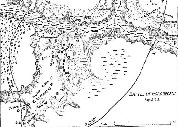
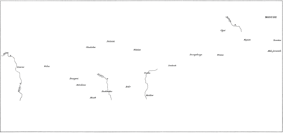
Here is for comparison the fold-out map by de Fézensac, on which Minard based his own representation:
And another map on the same subject, representing the type of map, which would have been available to Minard at the time:
Click for a larger image (3,029 × 949 px).
Von Merz’s and Menke’s map is particularly of interest, since it depicts the sheer abundance of detail, namely river runs, absent in Minard’s presentation. There are even faint markings for terrain:
Here, we may also observe another of the most common features of maps, which is missing in Minard’s, namely a grid, which isn’t only providing the means of reference, but also asserts the spatial continuity and consistency of a map.
By overlaying von Merz’s and Menke’s map by Minard’s version, we may finally assess Minard’s cartographic presentation for its constituting properties:
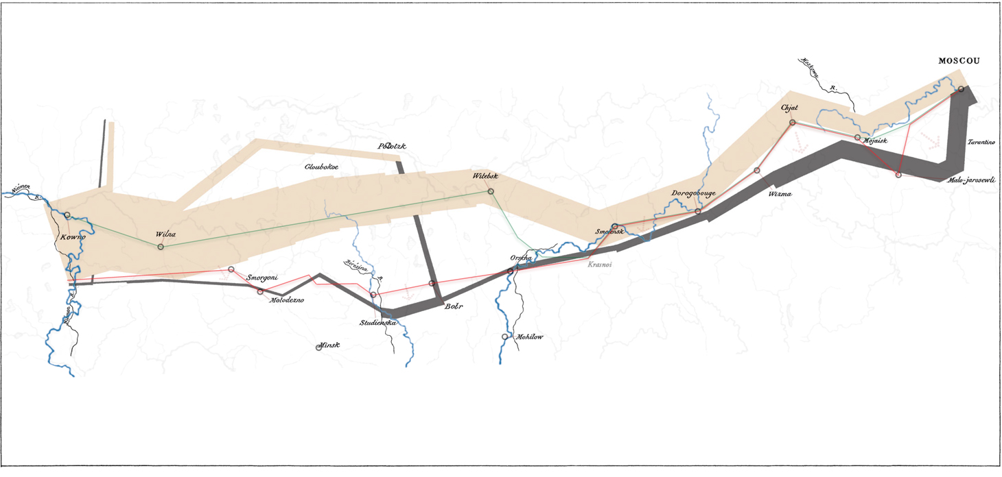
River runs in blue are as represented by von Merz and Menke, green and red lines connect waypoints (circles) as found in this latter map. Markings in black are Minard’s representation of geography.
Note: There are differences in the type of projection used by Fézensac (and, to all probability, by Minard, as well) and by von Merz and Menke, i.e. the latter using a less cylindrical type of projection. However, the resulting deviances do not affect the general picture. Here, we’ll use an unadjusted, direct overlay for sake of simplicity. Also, since Minard doesn’t provide any grid references, any such adjustments will be approximate at best and even questionable in the worst case. Nevertheless, allow for the doubt of a few millimeters in the comparative overlay in its full size.
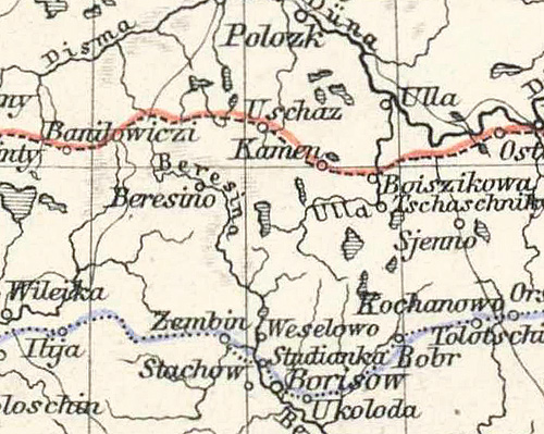
Aligning the two representations precisely proves particularly difficult. One of the reasons for this is Minard’s peculiar rendition of rivers, the only features, there are. Take for example the Niemen (or Memel): While de Fézensac provides a fairly accurate representation, the version presented by Minard’s, claiming de Fézensac as his cartographic source, diverges in a way and suffers a deformation, which renders it rather a mere annotation than a projective representation, making it hard to tell, what geographical feature is supposedly depicted.
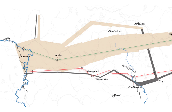
The alignment of the maps, using what we may guess being the right part of the Niemen and Moscow as points of reference, reveals a characteristic drift of features. It’s only at Polotsk and Minsk that the two maps actually do match. Specifically, it’s about a distinct, generally southern drift of the return leg, separating it from the Moscow-bound, invasive movement, a separation by an offset, which is also suggested by the double, vertically stacked representation of Moscow, marking both the end and the beginning of a leg.
It is by this artificial separation of primary movements that Minard hides one of the major reasons for the army so alarmingly diminishing, namely areal containment by which an army, already suffering from overstretched logistics and meant to live “off the land”, was forced to traverse the same area of scorched land it had already been traversing and exploiting before. What are actually overlapping routes, become well separated, isolated movements by this southern feature drift, which also results in a separation of these segments or “chapters” of the narrative conveyed by the presentation.
It is for this striking lack of spatial consistency that we may assess: No, it’s not a map, at least not in the strictest of senses. However, this is not due to mere deficiencies in the craft or sheer incompetence, it is rather a constitutive part of Minard’s story telling. But more on this below.
How Many?
Something seems to be going on with the head-count, as well. Generally, a marching leg is represented in Minard’s graph by a rectangular shape, suggesting a consistent strength of the army for a given segment. Accordingly, we find the number of men still alive typically near the middle of a given leg. (That is, with the notable exception of Moscow, representing a static number at a fixed location.) There are a few difficulties with this: Are the data points for the head-count identical to the way points (turning points as represented by the graph), and, if so, is the count to be assumed valid for the beginning or for the end of any length connecting these points? Or, is the head-count provided independently, thus forming hidden data points which are located somewhere in between?
While this fuzziness doesn’t especially help with regard to the scientific qualities of the presentation, Minard may have an argument for this. Actually, the conception of an army passing a particular point at a particular time in a particular strength is somewhat hilarious. In reality, the marching army will be stretched out over miles and miles, passing a given area over days or even weeks, and not just on a single road. The movements of an army and its strength at a given point in time are actually fuzzy. Here, while still obscure regarding his methods, Minard may be nearer to the truth than what any pinpoint accuracy may suggest.
I’d also suggest that there may have been aesthetical decisions involved, regarding the control of information flow and the density of information provided in general. Minard probably didn’t want to overload the waypoints, which already represent a peak in visual information density. By moving and associating the numeric representation of tha data to the marching legs, Minard establishes both a sense of movement and an equilibrium of information density. The latter also facilitates the impression that data has been presented in a meticulous and comprehensive manner, covering all there is.
However, there are still inconsistencies: There are two methodological exceptions to the rules, namely the leg from Wilna (Vilnius) to Witebsk (Vitebsk) and a short stretch just before the crossing of the Berezina, where Minard chose to interpolate the number of men in the visualization. The leg from Vilnius to Vitebsk actually consists of two segments and includes a subtle turn (at Gloubokoe / Glubokoye), but this is somewhat obscured by the treatment.
While this may account for the lack of data available for the long stretch from Vilnius to Vitebsk, the second one is hinting at an influence, Minard is careful to eclipse from his presentation else, namely military action, particularly engagements preceding the crossing of the Berezina. However, this is just a small stretch and, if we were to detect it, we were probably in awe for the meticulous care exhibited by Minard at this point, to account even for minute detail. (Notably, the battle of the crossing of the Berezina is commonly regarded as the darkest point in the history of the Grande Armée in Russia and we may expect some attention being payed to this particular part of the graph by the intended audiences.)
3) Textual Strategy
So far, we have identified a major transformation of the geographical data, which is crucial to Minard’s chart. This peculiar, southward transposition of the path of the retreating army may have still been done in the best of faith and intentions, as it facilitates the reading by separating the overlapping paths of the invasion and retreat in what are distinctive segments of an epic undertaking, all in the name of clarity and a reduction of complexity for the sake of comprehensiveness. There is an argument for this. This transposition may be even necessary in order to clarify that the meteorological data is valid only for the return. (However, we may note that this transposition encompasses not just a parallel shift, as may be expected for such a purpose.) But there is more to it, as it also transforms the forth and back of a lateral movement into a circular, looping one.
By rendering the path of the army as a circular motion, Minard also adds a closure to it, representing it as an isolated, self-contained narrative. And, most crucially, as this closure is rounding up the scene depicted into an all-encompassing whole, it suggest that it is rendering the entire picture, providing all there is. This is also facillitated by the placement of the numbers giving the respective head-count of the marching army, which not only provides a finely tuned balance to the graphic, but shifts our attention from the waypoints to the legs, which are forming the path of this circular progression. A circular progression, which also hints at the voidness and nullity of the venture depicted, thus supporting the apparent moral, the emotive concern and emphasis of the narrative.
Arguably, this closure contributes to the eloquence often observed in Minard’s presentation, which, as Étienne-Jules Marey put it in 1878,
“defies the pen of the historian in its brutal eloquence.”
(Étienne-Jules Marey, La Méthode Graphique dans les Sciences Expérimentales. G. Masson, Paris, 1878.
cit. Michael Friendly, Minard, Charles Joseph, in: Encyclopedia of Statistical Science, datavis.ca, 2006)
An eloquence, which relies on a suggested completeness of the data as presented, while, at the same time, reducing the presentation to its bare minimum. The transformation and distortions, Minard’s rendition of the scene has undergone, may still serve the purpose of comprehensive presentation and of an intended impact of the data conveyed. As observed by Arthur. H. Robinson and Michael Friendly, the kind of thematic cartography, prominently featured by Minard, always involved compromises between accurate rendition of geography and representation of data, for this rather called “cartes figuratives et approximatives” by Minard, who defied the “tyranny of precise geographical position.” — “Accordingly, he revised coastlines, paid little attention to projections, and forced the scales of the geographic features on his maps to fit the data being portrayed, rather than vice versa, as is usually done today.” (Arthur H. Robinson, Early Thematic Mapping in the History of Cartography. Chicago: University of Chicago Press 1982. cit. Michael Friendly, 2002, ibidem, p. 33)
Notably, this is not a neutral, scientific visualization of data. It involves choice, bias of attention, and interpretation. It essentially conveys a narrative. In the particular case, it not only favors a specific reading, it also excludes contesting ones as the inclusion of additional geographical space virtually leaves no room for a reading that may be more aligned to an historical reading as it is assumed correct today. This is not the story of an army suffering from diseases nurtured by overstreched logistics, rain, and hunger, from areal containment by the asymmetrical tactics of a guerilla warfare, forced to live off the same areas of scorched earth already exploited, and a series of battles and skirmishes. Not only is none of this represented in Minard’s chart, it actively opposes such an interpretation by obscuring the fact that the army was essentially traversing the same paths, forth and back again, for about half of the distance involved.
What Minard’s chart does depict, is the story of an army meandering over enemy territory, an army, which, while actually arriving at its goal, is essentially defied the decisive battle and thus left to meet its fate by a higher power, which is weather, namely freezingly low temperatures.
We have already addressed some of the aesthetical means and qualities which facilitate the impression of conclusiveness peculiar to this picture. But there are also some notable inconsistencies involved. First, there is a missing date for a temperature (“− 11°”) associated to the reunification of the army near Bobr. While this may be just a simple lapse on the side of Minard or the lithographer, this is highly unlikely, considering the various persons intimately involved in the preparation of the graphic and the overall care applied. Rather, we may assume that no sure date was available for the respective reading. So, why wouldn’t it have been excluded in the first place, why had Minard chosen to include it all the same? Probably, for the same aesthetical reasons, as this data point is crucial to the general parallelization of the invading movement and the temperature graph, which establishes the foundations for the contrapuntal juxtaposition of the retreating motion and the binding of the two paths in a composition that is at the same time concise and convincing.
Then, there is a second major inconsistency, which is also an inconsistency in methodology, namely the linear interpolation of the long leg from Vilnius to Vitebsk. While it is also the longest leg in the entire graph, it is notably the leg, which encompasses the largest absolute loss in men suffered in the entire campaign. Out of the 340,000 men alive in Vilnius (400,000 − 60,000 diverging to Polotsk) 165,000 have perished, with just 175,000 still alive at Vitebsk. Notably, losses occurring on this single leg of the march into Russian territory exceed in absolute figures any losses occurring over the entirety of the retreat, which may be somewhat inconclusive, if not contradicting, to the overall message conveyed. However, the linear interpolation of the stroke width doesn’t just provide a bit of visual variety and a diffuse sense of drama, it also helps mitigating the visual weight of the losses represented by the diminishing stroke width, by this supporting the narrative. In effect, this peculiar methodological choice, in combination with the diverging path branching to Polotsk, obscures the fact that we jump from 400,000 men alive in Vilnius (which is the army still intact, since 22,000 of the initial 422,000 were diverging north before and do not account to losses) to just 175,000 (or 43.75%) at Vitebsk, which, if we were aware of it, must certainly ruin the narrative impact and conclusiveness of the presentation.
Still, there is more to it, as we are facing a case of double-layered rhetorics: There’s a narrative frame to this presentation. This is France’s aging master, presenting a last great piece, his legacy, as a gift to the nation, not only a showpiece of his praised methodology, a last, final example of what can be done by its application, but also a comprehensive interpretation of a subject, which is of broader concern to the nation, which it must observe, with due attention and even approval. There’s a massive import of good will going with this. It is not just about the particular rendition, it is about the remembrance of a perishing army, the grief and grandness of a nation, and the legacy of a great man. We (as a contemporary observer) must allow for a bit of freedom for a case which is as honorable and great as this. Even, if we were to dissent from the message conveyed, be it in the minute detail or in the grand scheme of interpretation, we must still remain in awe in front of this masterpiece. — Which sets a frame for reading, which still catches on to the day.
Who Is Talking?
Charles Joseph Minard signed this piece as “Inspecteur Général des Ponts et Chaussées en retraite”, inspector general of bridges and roads in retirement. This isn’t only a prominent engineering positions, it’s also — in the times of the industrial revolution — a key position for the development of the country, as roads, bridges, canals and railways were key to general logistics and the allocation of industry, maintaining and lining out the axes of further development. A position vital to the political economy of France. While not always successful in his proposals, Minard was highly regarded in this position.
Minard held classes at the School of Bridges and Roads, was officer of the Legion of Honor, and in 1846 he was proposed by the Ministers of Public Works to the king, Louis-Philippe, as an additional member of the Council of Bridges and Roads formed by the inspectors general. The obituary, written in 1871 by Minard’s son-in-law, Victorin Chevallier, provides a rendition of the proposing report:
The terms of the report to the king are too flattering [to be omitted from] the text.
“Mr. Minard,” the report said, “is without contest the member of the Council who has the most deepened, be it as an engineer, be it as a professor at the School of Bridges and Roads, the theory and the practice of works at sea. No member has occupied himself with more interest with the problems of railways from the point of view of political economy. His writings on these two branches of knowledge enjoy a deserved reputation.”
Victorin Chevallier, “Notice nécrologique sur M. Minard, inspecteur général des ponts et chaussées, en retraite” in: Annales des ponts et chaussées, Series 5, Vol. II, 2nd sem. (1871), pp. 1-22. Translation by Dawn Finley.
Forced into retirement in 1851, by an age limit of 70, Minard applied for membership to the Académie française the next year, which he had also done in vain in 1850, but failed to be accepted again, “although written down as the first on the list of presentation, he had only twelve votes” as the obituary bitterly remarks. Thus confined to private study, Minard dedicated himself to a growing body of statistics, graphic tables, figurative maps, which he had already begun in 1845 with a figurative map on the subject of passenger traffic on roads and railways.
Minard’s career renders him a man deeply affiliated and entangled with the French state and the monarchy, which is also pointed out by a remark found in Michael Friendly’s Visions and Re-Visions of Charles Joseph Minard, citing the obituary:
Minard’s influence and contributionto visually based planning was such that, from about 1850-1860, all Ministers of Public Works in France had their portraits painted with one of Minards’ creations in the background (Chevallier, 1871, p. 17).
In 1861, some of Minards’ works were presented to Napoleon III (a singular honor for an engineer of middle-class background), who received them with enthusiasm.
(Michael Friendly, 2002, ibidem, p. 33)
Thanks to R.J. Andrews (compare his article Finding Minard) we also know an example of this testament of governmental appreciation, a portrait by Alexandre Cabanel of Eugène Rouher, ministre de l’agriculture, du commerce et des travaux publics in 1855-63, which was presented at the 1861 Salon. The particular map is on the subject of trade in France, titled “Carte figurative et approximative des tonnages de marchandises qui ont circulé en 1857 sur les voies d’eau et de fer de l’Empire français” (Figurative and approximate map of the tonnages of goods which circulated in 1857 on the waterways and railways of the French Empire).
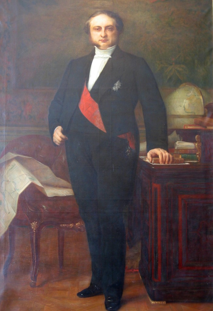
Mind the map spread on the chair in the background, left.
Photo/image source: infowetrust.com.
It is nearly impossible to see Minard’s map on the Russian Campaign of 1812-13 outside this entanglement with the regime. Napoleon III, previously heading the Second Republic as its only president as Louis-Napoléon Bonaparte, had become Emperor of the French on 2 December 1852, the forty-eighth anniversary of the coronation of his uncle, Napoléon Ier. Napoleon III had explicitly compared himself to his uncle, especially for his military feats, in the context of the Crimean War (1853–56), a somewhat ill-fated, while victorious military venture, plagued by diseases and logistical failures (especially on the side of the British allies) much like his uncle’s. By the mid-1860s, the Second Empire was facing increasingly the mounting power of Prussia, which might have inspired a first chart by Minard on a military expedition of Napoleon as an example of French grandness and historic accomplishments, published in 1865 under the title “Similitude des dispositions stratégiques de Charlemagne et de Napoléon Ier. L’un dans sa campagne en 791 contre les Huns, l’autre dans sa campagne en 1805 contre les Autrichiens et les Russes” (Similarities in the strategic dispositions of Charles the Great and Napoleon I. The former in 791 against the Huns, the latter in his campaign of 1805 against the Austrians and Russians.).
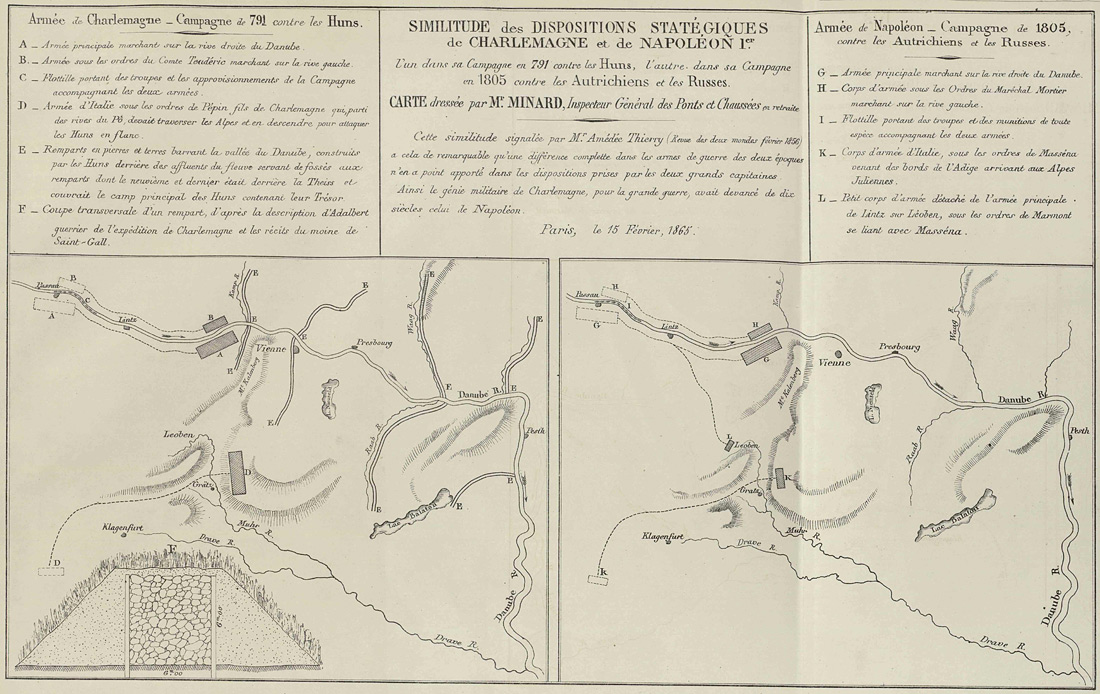
Charles Joseph Minard, “Similitude des dispositions stratégiques de Charlemagne et de Napoléon Ier. L’un dans sa campagne en 791 contre les Huns, l’autre dans sa campagne en 1805 contre les Autrichiens et les Russes.”, 1865.
(Notably, this chart provides all the tactical properties, missing in the map of the Russian campaign, like position and movement of troops, logistics (shipping), terrain, etc.)
The descriptive text of this chart explicitly compares Napoleon I to Charles the Great in terms of military genius, a similarity in leadership, which seems to transcend the specifics of the epochs:
SIMILITUDE des DISPOSITIONS STRATÉGIQUES de CHARLEMAGNE et de NAPOLÉON 1er.
l’un dans sa Campagne en 791 contre les Huns, l’autre dans sa Campagne en 1805 contre les Autrichiens et les Russes.
CARTE dressée par Mr. MINARD, Inspecteur Général des Ponts et Chaussées en retraiteCette similitude signalèe par Mr. Amédéc Thierry (Revue des deux mondes féverier 1856) a cela de remarquable qu’un diffèrence complettes dans des armes de guerre des deux èpoques n’en a point apporté dans les dispositions prises par les deux grands capitaines. Ainsi le génie militaire de Charlemagne, pour la grande guerre, avait devancé des dix siècles, celui de Napoléon.
Paris, le 15 Fèvrier, 1865.
English translation (by me, N.L.):
Similarities in the strategic dispositions of Charles the Great and Napoleon I.
The former in 791 against the Huns, the latter in his campaign of 1805 against the Austrians and Russians.
Chart drawn by Mr. Minard, Inspector General of Bridges and Roads in retirement.This similarity pointed out by Mr. Amédéc Thierry (Revue des deux mondes, February 1856) is remarkable in that a complete difference in the weapons of war of the two epochs had no effect on the arrangements made by the two great commandants. Thus the military genius of Charles the Great, for the great war, had preceded by ten centuries, that of Napoleon.
Paris, 15 February, 1865.
In 1869, a confrontation with the rising power in the East must have been foreseeable — as it became reality in the next year, which found France without allies in the Franco-Prussian War of 1870, eventually leading to the end of the empire by the defeat and capture of Napoleon III at Sedan. A conflict, and maybe even an outcome, which must have been foreseeable, at least for those, who cared about politics and political economy. In the ranks of which we have to count Minard. It’s the past decades of French history, from the Napoleonic Wars over the Second Republic to the restored empire and the pending confrontation and possible doom of the Second Empire that provide the frame of reference and context for the chart of the Russian Campaign of 1812-13. — So, is it a commentary, as well?
Same Sheet, Another Chart
Today, Minard’s chart of the Russian Campaign of 1812-13 is mostly seen and reproduced in isolation. However, in its original form of presentation, it is led by another chart. Like the sheet of 1865, it aligns and compares a military campaign of Napoleon with a military feat of a nearly mythical leader of the distant past. In 1865, it was Charles the Great opposing a threat emerging from the East, here it’s Hannibal’s crossing of the Alps as he’s actively addressing a mounting opposition in the North-East.
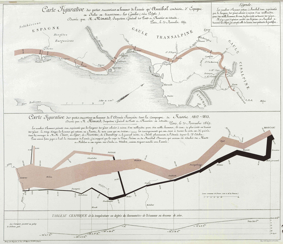
This first chart is titled — and we may observe the similarities — , “Carte Figurative des pertes successives en hommes de l’armée qu’Annibal conduisit d’Espagne en Italie en traversant les Gaules (selon Polybe)” — “Figurative Map of the successive losses in men of the army of Hannibal progressing through Spain to Italy by traversing Gaul (according to Polybius)”.
Like its counterpiece, it depicts the epic story of an army progressing into enemy territory, just to aimlessly meander as it is denied the decisive battle. Like its counterpiece, it depicts a dramatic loss of men, painstakingly annotated in small figures, from 94,000 to 26,000. Like it is suggested by the counterpiece, the dramatic losses are not due to enemy action, but due to a higher force, which is nature. (And, like its counterpiece it eclipses any military encounters, as well.) It presents a parallel in history, which is visually supported by the parallel alignment of the two graphs, each representing an army progressing towards its fate. Notably, this alignment is not a natural one, as may be observed by the skew orientation of the North-pointing arrow on the first map, and it is emphasized by the red ink marking the paths of the two advancing armies. And, like we have seen it in the composition of the two paths of the Russian Campaign of 1812-13, the two graphs are presented in a contrapuntal composition, each answering the other one in a roughly symmetrical movement, especially, if we consider a weighted average of the double paths for the second one.
Clearly, this is visual rhetoric. Contemporary, it has been received as a lamento of men falling prey to the ambitions of military leaders, and it is still perceived this way today. Marey remarked the “brutal eloquence”, while the obituary observed,
Finally, in one of his last maps, at the end of 1869, as by a premonition of the appalling catastrophes which were going to shatter France, he emphasized the losses of men which had been caused by two great captains, Hannibal and Napoleon 1st, the one in his expedition across Spain, Gaul and Italy, the other in the fatal Russian campaign. The armies in their march are represented as flows which, broad initially, become successively thinner. The army of Hannibal was reduced in this way from 96,000[sic] men to 26,000, and our great army from 422,000 combatants to only 10,000. The image is gripping; and, especially today, it inspires bitter reflections on the cost to humanity of the madnesses of conquerors and the merciless thirst of military glory.
(V. Chevallier, 1871, transl. Dawn Finley; ibidem)
However, this may rather convey the sentiment of the recipients in the light of the aftermath of 1870 than Minard’s original intention. Provided the first, similarly themed sheet on Napoleon of 1865 and the kind of relation Minard entertained with the regime of Napoleon III and the likeness the latter took in his uncle as a military genius, we have little reason to assume this to be a lamento of the fallen men only. There may be a foreshadowing notion of the vanity of military conflict involved, even a warning, as the nation was preparing reluctantly for the confrontation to come, but this is not the emphasis of the sheet, considering the two charts as a whole.
The emphasis is clearly on the red paths, aligned to each other, suggesting a higher equivalence, a parallel in moral. Notably, the Hannibal chart eclipses the entire part of doom and failure in Italy, the march across the Alps being commonly perceived as the rising part of the narrative, an epic, most unlikely achievement, a wonder of the world in military leadership. Similarly, the chart on the Russian campaign shifts any notion of doom and failure to the black path of the retreat, by this elevating the invasive part to the status of a progression into the vastness of Russian territory, which has been deemed unlikely, even incomprehensible as well. Notably, Hannibal’s march is still remembered as a great, incomprehensible feat, more than two millennia later, while we know little about the particular goals of the venture or what the army was actually doing while lingering in southern Italy for years.
Hannibal’s crossing of the Alps is not a story of failure, rather, it’s the story of achieving the unachievable. The story of man opposing and rising above the bounds set by nature, a feat of accomplishment and superior leadership. It’s also the story of an army, taking the losses for a higher goal, in order to achieve an unexpected advantage by achieving the impossible. It’s civilization in its finest hour, refined mankind at its best.
What this sheet suggests, is that the two undertakings should be read in parallel. It is not the eventual loss, which will be remembered, which will be still remembered in a distant future, over the millennia that are to come, but the army achieving the impossible, while accepting and embracing the inevitable sacrifice. It’s not the doom the graphs are speaking of to us, but of the feats and achievements, of human resolution overcoming the boundaries of imagination. And it suggests to a still grieving nation, which was at this very time separating itself from its emerging enemy in the name of l’humanité that it was part of this great story, the story of rising mankind — and, maybe, that Napoleon III was a guarantee for this.
4) Final Assessments
How should we assess this piece?
— Is it an example of erroneous inconsistency, flaws, failure, or even incompetence? Certainly not.
— Is it persuasive, even manipulative? Certainly, yes.
So — in the words of 2018 — is it “fake”, is it contrary to truth, or is it — again in the words of 2018 — rather a case of “perceived truth”?
I’d suggest that to a meticulously crafted piece like this, much like to a body of theory or to a work of art, the question of truth can only be applied when considering it in the bounds of its constitutive framework. As we have observed already, a certain amount of freedom from the “tyranny of precise geographical position” in order to convey a message is part of Minard’s methodological framework of “cartes figuratives et approximatives”, even, if the term “approximative” is missing in the titles of the very charts assembled on this particular sheet. But, we may ask, what kind of framework would this be? While it is not particularly about a neutral, scientific presentation, it is still about a presentation of facts. It is about informing and instructing a broader public, about education. In this particular case, it is about instructions regarding the past, in short, history. However, this is not modern history. It is not about just a neutral presentation of facts, it is not about learning of past events, this is 19th century history: It is about learning, who we are, about presenting a goal to aspire to, in order to become, who we were. In other words, it is about nation building.
We may also note that these comparative charts on Napoleon’s campaigns emerged at a certain moment in history, when France began to see itself encountered by an emerging nation, which embraced a process of nation building of its own. Namely, Germany pictured itself in the mirror of Tacitus’ “Germania”, properly “De Origine et situ Germanorum” (On the Origin and Situation of the Germans), which so soothingly salvaged the nation from a lacking historic past by the invention of a barbaric nation that was at the same time uncivilized and living in the state of natural justice of the Golden Age. While German tribes did certainly exist, this fictious nation served rather as a backdrop for the defamation of the Julian family and its reign, which didn’t do much of a damage to the imagination of the aspiring nation in pursuit of its specific pride.
Note: As a German native speaker living a in German speaking country, which is also amongst Napoleon’s adversaries as presented in Minard’s charts, I’m qualified to utter a few snarky remarks on German nation building. Please, read with a grain of salt.
France answered by picturing itself as the example of humanity as such, facing the threat of the barbaric, like the Huns, whom Charlemagne had encountered in defense of the blooming civilization of the middle ages. Minard’s sheets align finely with this higher moral. Notably, in the first sheet of 1865, there’s France, in its mythical, distant origins and in its recent past facing a concrete opposition, which may stand for the emerging Eastern threat. In 1869, as the real threat of an actual confrontation emerges, Minard is careful to eclipse any notion of a human opposition, even of conflict per se, rather presenting a pure picture of l’humanité et civilisation, which exemplifies the heritage of the nation, which is the heritage of civilized humanity, and which may be also read as an appeal to its future.
As such, in this frame of reference, it’s an outstanding masterpiece, a flawless example of visual rhetoric, and true to its higher meaning, as well. As this, it may be still appreciated and held in high regard today. Where others may see inconsistencies, even flaws, I’d suggest to appreciate a rare chance of observing textual strategy in visual presentations at work, as applied by a master of his craft. — Notably, these are strategies which have held up well to the present day, as the canonical reading of Minard’s Russian Campaign of 1812-13 still adheres much to his intentions.
Addendum: A Peculiar Centenary
1869 marked also the 100th birthday of Napoleon, who was born on 15 August 1769. Minard’s chart, dated 20 November 1869, was published amid the commemorations surrounding the anniversary, which we may expect to have fostered a favorable view of the first Emperor of the French, to whom his nephew and mediate successor, Napoleon III, was referring himself, not the least for legitimacy. Napoleon III had already elevated the day of the anniversary, 15 August, to a national holiday, “Saint Napoléon”, in 1852, especially in order to associate Napoleon with the Second Empire as the founder of the dynasty. We may note that Minard’s sheet of 1865, parallelizing Napoléon 1er and Charlemagne, had already served this purpose as well. Napoleon, lacking a dynastic legitmation of his own, had ostensively revived and fostered the memory of Charles the Great, eventually blending the image of the father of the French monarchy and restorer of the Roman Empire with his own. (Compare “Napoleon and Charlemagne” by Thierry Lentz.) By invoking the congruency of the two emperors, Minard’s sheet of 1865 also establishes a vector, which is pointing at a third, the then current Emperor of the French, including him in the claims evoked by the blended image.
However, 1869 was also a difficult year for the restored empire. Around the legislative elections of June 1869, which brought a majority of pro-republican votes in major cities, like Paris, Lyons, or Marseille, the country had seen unrest and even violence. (Compare Émile Kern, “Représentations et images contrastées de Napoléon dans les commémorations : de 1869 à 2009”, thesis, Université de Montpellier 3, 2011.) By mid-August, the political climate was still tense. While the aging emperor, Napoleon III, was ill and weak, both by health and poltical strength, Napoleon I was maybe even less, by some seen rather as the incarnation of despotism, the rule of the elites, than as the founder of a laicistic but still sacred empire, for this rather compared to Alexander the Great than to Charles the Great. The glory of the empire and of the reign of Napoleon III had become fragile, as he was facing a mounting opposition, not only by Prussia, but, most importantly, internally, as well. While the centenary was thus peculiarly overshadowed and lacking a celebration in the extent, we may have expected, any allusion to Napoleon I, like Minard’s sheet of Hannibal and Napoleon encountering the East, was inevitably rising to the status of a political statement.
Notably, Hannibal is a military leader, not a political one, having spent most of his life in military campaigns. While clearly part of the elite, Hannibal is not an agent of the authoritarian — he is not Alexander the Great. While the graph depicting his crossing of the Alps does take meticulous account of the perishing men, the common narrative is still about the achievement, they had given their life for. While the opening movement depicted in the chart resulted ultimately in doom and a failed campaign, it still must have spoken to any humanist beholder of ingenuity and resolution: The sheer existence of the narrative is a guarantee for the men not having fallen in vain. (However, there's still an ambivalence in this, allowing for an alternative reading in the aftermath of 1870.) The congruency shown in this second sheet of 1869 is not that of a national empowerment, but, by extendending the temporal distance, shifting towards the absolute, towards values of honor and merits, which transcend the merely national, the merely political. The tale told is the tale of history, the history of — in contemporary understanding — all mankind, emphasizing will and resolution, even a resolution towards sacrifice for the greater good. The political situation of the peculiar centenary may also provide an explanation for Napoleon’s name missing so ostententavily in the title and the description of the chart, like a means of suspending any verdict on the man, rather shifting the attention to his ambivalent endeavor, which is presented in the context of the greater historical narrative. Nevertheless, it is still, undoubtably, about Napoleon. Inscribing Napoleon into this narrative suggests a recontextualization of his role and of the particular national tragedy, in the sense of an eternal tale, which is the tale of mankind. And, quite naturally, this impulse was to extend to his heir, as well.
If there is an appeal, it is not just an appeal in spite of an unkown outcome, it is an appeal in face of the unknowns encountered, in order to inscribe a common fate in the very annals, which have informed and educated the beholders. But in order to so, the beholders will also have to gather behind a leadership, which is pointed out by a vector that is quite similar to the one emerging from the sheet of 1865.
Epilogue
A distant, but unrelated echo to the theme of not–by–enemy is provided in Karl Kraus’ sarcastic and truly apocalyptic rendition of Austria being engaged in a World War (the first one), thus liberally exhibiting the nasties and atrocities normally hidden behind its peacetime niceties, as found in his masterpiece of grim irony and subtle verismo, “Die letzten Tage der Menscheit” (compiled 1915–1922, Engl., The Last Days of Mankind) by the example of instructions regarding the proper communication of the loss of fort Przemyśl:
II. Akt, 16. Szene
Ein anderes Bureauzimmer.
Ein Generalstäbler (erscheint und geht zum Telephon): — Servus, also hast den Bericht über Przemysl fertig? — Noch nicht? Ah, bist nicht ausgschlafen — Geh schau dazu, sonst kommst wieder zum Mullattieren zu spät. Also hörst du — Was, hast wieder alles vergessen? — Ös seids — Hör zu, ich schärfe dir noch einmal ein — Hauptgesichtspunkte: Erstens, die Festung war eh nix wert. Das ist das Wichtigste — Wie? Man kann nicht — Was? man kann nicht vergessen machen, daß die Festung seit jeher der Stolz — Alles kann man vergessen machen, lieber Freund! Also hör zu, die Festung war eh nix mehr wert, lauter altes Graffelwerk — Wie? Modernste Geschütze? Ich sag dir, lauter altes Graffelwerk, verstanden? No also, gut. Zweitens, paß auf: Nicht durch Feindesgewalt, sondern durch Hunger! Verstanden? Dabei das Moment der ungenügenden Verproviantierung nicht zu stark betonen, weißt, Schlamperei, Pallawatsch etc. tunlichst verwischen. Diese Momente drängen sich auf, aber das wirst schon treffen. Hunger is die Hauptsache. Stolz auf Hunger, verstehst! Nicht durch Hunger, sondern durch Gwalt, ah was red ich, nicht durch Gewalt' sondern durch Hunger! No also, gut is — Was, das geht nicht? Weil man dann merkt, daß kein Proviant — wie? — und weil man dann einwendet, warum nicht genügend Proviant? Alstern gut, gehst drauf ein und sagst: unmöglich, so viel Proviant als notwendig aufzuhäufen, weil's eh der Feind kriegt, wann er die Festung nimmt — Wie er sie dann genommen hätte? Durch Hunger? Nein, dann selbstverständlich durch Gewalt, frag net so viel. Verstehst denn net, wenn er also die Festung durch Gewalt nimmt und mir ham an Proviant, nacher nimmt er auch den Proviant. Darum dürfn mr kan Proviant haben, nacher nimmt er kan Proviant, sondern er nimmt die Festung durch Hunger, aber nicht durch Gwalt. No wirst scho machen, servus, muß in die Meß, habe nicht die Absicht, mich durch Hunger zu übergeben — Schluß!
(Verwandlung.)
And here’s the English translation by Michael Russell (complete working translation, © 2013):
Act II, Scene 16
Another office room.A member of the General Staff (enters and answers the telephone): — Hello, so have you finished your report about Przemysl? — Not yet? Ah, you are not up yet — come on, get going, or else you'll be late again for the party. So listen — what, you have forgotten it all again? — You're something else — Listen now, I repeat it one more time — Main aspects: The fort was worthless anyway. That's the most important — Pardon? One cannot — What? One cannot make them forget that the fort has always been the pride — dear friend, there is nothing that one cannot make forget! Now listen, the fort was worthless, nothing but a pile of old junk — Pardon? State–of–the–art ordnances? I am telling you, nothing but a pile of old junk, understand? Good, talking sense at last. Secondly, pay attention: Not the enemy's force, but hunger! Right? At the same time, don't point too much to the insufficient food supplies, you know, sloppiness and all that mess have to be obliterated. These aspects will shine through, but I'm sure you'll find the right tone. Hunger is the main issue. Pride against hunger, you understand! Not through hunger, but through force, ah what am I saying there, not through force but through hunger! Right so, that will do — What, that's not possible? Because it becomes obvious that without supplies — pardon? — and because one will ask why there were not enough victuals? All right then, respond to it and say: impossible to stock up on the amount of victuals needed, because they would only fall into enemy hands when he takes the fort — how could he take it? Through hunger? No, in that case of course it would have to be through force, stop asking silly questions. Don't you get it, if he takes the fort through force and we do have victuals, he'll end up taking the victuals as well. Therefore we must not have too many supplies, so's he can't take the supplies but has to take the fort through hunger instead of force. Well, I'm sure you'll sort it out, have to go to the mess now, don't intend to surrender through hunger — enough!
(Change.)
Note: “Die letzten Tage der Menschheit”, according to the introduction a play of “hundred scenes and hells” and meant to be performed in a Martian theater, consists of an amalgam of various, imaginary scenes that gave birth to news articles actually found in the contemporary press, representing in combination (about 770 pages in fine print) something very much alike the stream of consciousness of a nation.
Norbert Landsteiner,
Vienna, 2018-08-17 (Addendum 2018-08-26)
Update: You may also want to have a look at the follow-up post (June, 2020):
“Visual Story Telling: Revisiting Minard’s Map of Napoléon’s Russian Campaign (1812–1813)”.
Discuss/comment on Google+…
Disscuss/comment on Hacker News… (um, front page, mumble…)