PET 2001 Dark Mode & Themed Range Sliders
Also, how to style range inputs using CSS, including accent colors.
So the PET 2001 emulator received a dark mode. This wasn’t exactly great news, nor worthy a blog post, if there wasn’t also something to be learned from every project. In this case, it’s about how to implement accent colors for custom styled HTML range-input elements, something, I haven’t found any hint on in the entirety of the Internet. (And, if there is, it wasn’t discoverable by search.)
This journey starts with me being somewhat opinionated, when it comes to user experience (with a small “U” and no ”X”). To me, this includes choice and empowerment, of the user that is. This is also, where I seem to diverge from the current UX movement, where choices are to be settled by the vote of an A/B test once and for all. (And, if there’s still a choice, it is to be hidden in the depths of the hierarchies of a Hamburger Menu, e.g., Hamburger > Settings > Application > View Mode > Dark, until it is ultimately stripped, since metrics indicate that nobody uses [read: finds] the feature. Compare features recently stripped from MS Edge.)
Anyways, I do not want to just rely on system settings (or global browser theme settings, which may not be the same), but let users chose the view mode, indepentently of any other settings.
However, the good deed of providing an independent choice also introduces another problem, namely, the case where the rendering of standard input elements, like buttons, checkboxes, radio elements or range sliders doesn’t align with the view mode chosen inside the application. The result may be dark elements standing out in an else light themed rendering domain and vice versa. Meaning, we have to customize these elements. Personally, I prefer to use standard HTML elements, as opposed to of running non-standard UI components of my own. Partly, because there obvious accessibility and interaction benefits from using standard elements, and partly, because we can still use any combining CSS selectors to our convinience.
Custom Styling
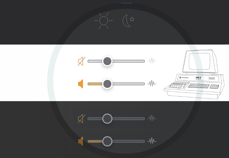
For this particular application, I decided to sick close to the UI language of Mozilla/Firefox. This is mostly, because this is a somewhat familiar UI design, which still provides easily recognizable controls.
(Meanwhile, other browsers use controls that may be hardly recognizable at all, like for empty/unchecked checkboxes. Which is somewhat a problem when the default state is off and we don’t have the screen estate to put the respective label on a line of its own, in order to draw a user’s attention to it. — Did I mention that I’m opinionated about these things? — Still, here, in the case of the PET emulator, we have just two lines to contain 17 controls in total, in order to fit the entire view onto the screen of a 10" tablet or a 13" laptop. No way to surround a checkbox label by the required white-space in order for the respective checkbox to become regognizable.)
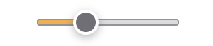
And here is the range input, AKA slider control, of our choice, a close relative of what’s currently rendered by Mozilla/Firefox, just a bit slimmer:
And here is the CSS code for this, applying CSS rules to the pseudo elements that make up the range slider, as exposed by the various browsers:
/* basic element */
input[type="range"] {
    -webkit-appearance: none;      /* disable standard appearance */
    appearance: none;
    width: 100px;
    height: 22px;
    background: transparent;
    outline: none;
    opacity: 0.785;                /* reduced opacity without focus */
    transition: opacity 0.2s;
}

/* interactive states */
input[type="range"]:hover,
input[type="range"]:focus,
input[type="range"]:active {
    opacity: 1.0;                  /* full opacity in active states */
}
input[type="range"]:focus {
    outline: none;
}

/* custom styling for Mozilla/Firefox */
input[type="range"]::-moz-range-track {
    height: 5px;
    box-sizing: border-box;
    border: 1px #77777B solid;
    background: #D1D1D5;
    border-radius: 2px;
}

input[type="range"]::-moz-range-thumb {
    width: 18px;
    height: 18px;
    background: #484850;
    border: 2px #fff solid;
    border-radius: 50%;
    box-sizing: border-box;
    filter: drop-shadow(0px 2px 3px rgba(0,0,0,0.35));
}

/* custom styling for Webkit-based browsers (Chrome/Chromium, Safari,…) */
input[type="range"]::-webkit-slider-runnable-track {
    -webkit-appearance: none;
    appearance: none;
    height: 5px;
    box-sizing: border-box;
    border: 1px #77777B solid;
    background: #D1D1D5;
    border-radius: 2px;
}

input[type="range"]::-webkit-slider-thumb {
    -webkit-appearance: none;
    appearance: none;
    width: 18px;
    height: 18px;
    background: #484850;
    border: 2px #fff solid;
    border-radius: 50%;
    box-sizing: border-box;
    filter: drop-shadow(0px 2px 3px rgba(0,0,0,0.35));
    margin-top: -8px;              /* relative to box of slider-runnable-track */
}

/* active/pressed state for slider thumb */
input[type="range"]:active::-moz-range-thumb {
    background: #F7C00C;
    transition: background 0.1s ease;
}
input[type="range"]:active::-webkit-slider-thumb {
    background: #F7C00C;
    transition: background 0.1s ease;
}
There are just a few things of note here:
- Other than with CSS properties, we can’t mix selectors for vendor specific pseudo elements, since browsers will ignore the entire rule as they encounter an unknown/invalid selector. So we have to style these pseudo elements separately, each browser family its own, even, while rules may overlap widely.
- We use rather a SVG
drop-shadowfilter than a simplebox-shadowfor thethumb, since the latter would be clipped by the box of the range input element, while the former is not and may spill out. - Finally, the
slider-thumbfor the Webkit variety is positioned relative to thetrackby the use ofmargin-top. This is, because the slider is actually composed of nested flex-box elements and the thumb is a child of thetrack.
But, we have still an issue, namely, we lost any accent color!
A Word on Accent Colors for Range Input Elements
Before we investigate this any further, we have to state that, generally, applying accent colors for range inputs by default is an exceptionally silly idea. This may be nice for some edge cases, like volume or temperature controls, but, in general, it’s a really a bad idea. Sadly, most browsers apply this highlight, extending from the “min” value to the user selected value‚ by default, even, if we do not specify an accent color, at all.
Nothing in the semantics of this element suggests that such an accent would have any meaning, as the range input is meant to let the user pick a discrete value from a predefined range of values. The name-giving range is the predefined continuum, not the discrete value picked by the user.
E.g., have a look at the following example:
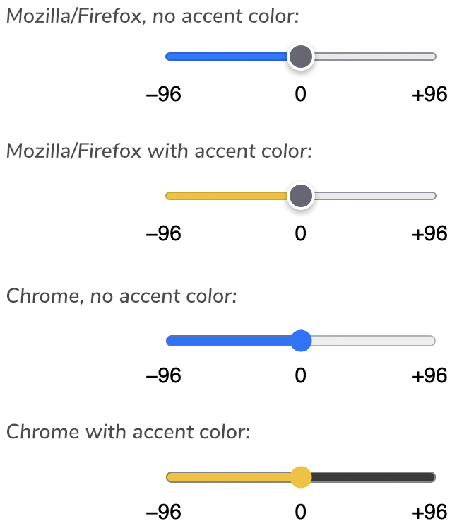
min = −96, max = +96(If no accent color is specified or it is set to "auto", the OS accent color is used.)
The combined flood-fill and heightened contrast in Chrome doesn’t especially help.
So “0” (zero) represents an extent of 96 units? Are you sure, dear browser vendor?
How? Why? I mean, what on Earth has become of numbers? (Asking for a friend.)
Sorry, this isn’t just silly, it’s stupid.
And, before you ask, setting the accent-color property to `transparent` doesn’t help, either:
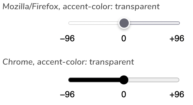
(Now we also know, why the remainder of the track is a dark void in Chrome.)
As this mess has been introduced already, there should be at least a way to configure this behavior, by a CSS property or by a an element attribute, preferably by both, dear Living Standards committee.
E.g. (proposal),
range-origin: <value> | <percentage> | initial | none;
In our above exampe, we may want to highlight the deviation from zero, which may be accomplished either by:
range-origin: 0;or by:
range-origin: 50%;
For convenience, we may want to tie the origin to the initial value of the slider (as provided by the “value” attribute of the range input element as it is initially encountered):
range-origin: initial;
And, most importantly, we may want to opt out of any accent coloring by:
range-origin: none;
which should finally releave us from the pest that are nonsensical and highly irritating slider highlights.
And, while we’re at it, can we, please, have color and background-color styles for select::menu and select:menu-item pseudo-elements? (Why do we need an entirely new, incompatible “selectmenu” element for this?)
Applying (Conditional) Accent Coloring for Mozilla/Firefox
Having ranted this, here, we’re actually dealing with a volume slider. Moreover, this comes with additional signalling, since processing sound comes with additional run-time loads. As in down-sampling an original 1 MHz pulse signal to 48 KHz high definition digital audio and then actually rendering the reuslting audio feed. We want the user to be aware of this being active and causing additional processing load, by this also consuming energy and affecting battery life, which may be entirely unnecessary, if the program in question doesn’t actually produce any sounds. (This is also why sound is an opt-in, if it hasn’t been preconfigured in a link. And, in the latter case, we ask the user first.)
Here, the accent color isn’t just a colorful add-on, it actually conveys state. So, for this specific application, we do want an accent color, while we just successfully got rid of it.
Mozilla/Firefox has covered us on this, as it provides a special pseudo-element for the highlighted area of the track:
input[type="range"]::-moz-range-progress {
    border: 1px #77777B solid;
    background: #F7C00C;        /* accent-color */
    height: 5px;
    box-sizing: border-box;
    border-radius: 2px;
}
(I’m not a fan of flood-filling the track and the thumb as Chrome does it, so this will suffice. — Just, maybe, this is not the most important element on the screen and we do not want this to stand out that much? Also, this combined fill and the resulting merging of shapes doesn’t provide exceptional readability.)
Moreover, we want to signal an active/deployed state. Therefore, we want to highlight this only, when and if the sound is actually on, which is controlled by a checkbox, just befor this range input:
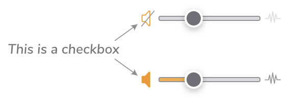
What we really want, is this to be just a copy of the normal track and to be accented only, if the sound checkbox iimediately before this is on/checked. As we chose to use a styled checkbox for the sound on/off control, we benefit from combining selectors:
/* normal state */
input[type="range"]::-moz-range-progress {
    border: 1px #77777B solid;
    background: #D1D1D5;        /* standard background color */
    height: 5px;
    box-sizing: border-box;
    border-radius: 2px;
}

/* accent color with checkbox #soundCbxOnOff checked */
input#soundCbxOnOff:checked + input[type="range"]::-moz-range-progress {
    background: #F7C00C;
}
Solving the Webkit Conundrum
So, what about Webkit-based browsers? What is the “-webkit-slider-track-xxx” pseudo-element for this? I’m truly shocked and sorry, dear reader, but I have to break the news that there is none.
— But, surely, JavaScript to the rescue, we may apply some dynamic styling to some background, e.g, by use of a linear-gradient for the -webkit-slider-runnable-track?
— Well, nice idea, but there is no way to select such a pseudo-element, as it’s part of the Shadow DOM, and, as we’re not the owner of this element, we can’t open() it. (So “document.querySelector( 'input[type="range"]::-webkit-slider-runnable-track' )” will, depending on the browser, return either null or trigger a syntax error in the CSS selector expression as it is evaluated.)
— But there must be a way around this, maybe, by dynamically rewriting CSS rules?
— Well, there is, in deed, the CSSStyleSheet object!
However, this is primarily used for defining styles for templates for custom HTML components, and its use outside of this domain is somewhat underdocumented. Which may be, why I haven’t found this used for addressing this specific problem anywhere else. In brief, we first create an instance of the CSSStyleSheet object, then we adopt this by a given element, and then we are free to modify this by the methods insertRule(), insertRule(), and replace() and any such dynamically applied or modified rules will propagate to the element(s) which addopted this CSSStyleSheet object.
The crucial question is here, which element or object is to adopt the CSSStyleSheet object? Well, as this ia about document-wide rules, it’s the document. And we adopt the style-sheet object by including it in an element’s `adoptedStyleSheets` property, which is an array:
let soundVolumeCSS = new CSSStyleSheet();
document.adoptedStyleSheets = [soundVolumeCSS];
Now we may dynamically (re)write any rules in this style-sheet object. This is what the method replace() does, which is actually “drop this rule, if it already exists, and then insert this new one”. There is no need to discriminate between insertRule() and replace(), and we can use the latter for both. This replace-method comes in two flavors: replace() returns a Promise, while there is also replaceSync(), which operates synchronously. As we have nothing else to do and target real-time interaction, we opt for replaceSync(). (Generally, I’d recommend to use a style-sheet instance per object, in order to keep this performant: as this will contain just a single rule, the processing load that goes with matching CSS selectors should be kept in check.)
And, to solve our specific problem, we will, indeed, use a linear gradient with a discrete color stop, right where the range slider thumb is currently located. This is what our gradient looks like with a stop at 40%:
linear-gradient(to right, #F7C00C 40%, #D1D1D5 40%)Mind how the first color ends at the same value, the second color starts at.
And this is the implemention:
var soundVolumeCSS = null;

// set active track for Chromium & Safari/Webkit
function setSoundVolumeTrack(percentage) {
    if (typeof CSSStyleSheet !== 'undefined') {
        // create the CSSStyleSheet instance, if it doesn’t already exist
        if (!soundVolumeCSS) {
            soundVolumeCSS = new CSSStyleSheet();
            document.adoptedStyleSheets = [soundVolumeCSS];
        }
        // apply the rule
        if (soundVolumeCSS) {
            soundVolumeCSS.replaceSync(
                'input#soundCbxOnOff:checked + input[type="range"]::-webkit-slider-runnable-track {' +
                  'background: linear-gradient(to right, #F7C00C ' + percentage + '%,' +
                  '#D1D1D5 ' + percentage +    '%);' +
                '}'
            );
        }
    }
}

// to be called from an event handler like this
// (that is, maybe a slightly more compact one):
function soundVolumeHandler(event) {
    var input      = event.target,
        min        = parseInt(input.min) || 0,
        max        = parseInt(input.max) || 100,
        value      = parseInt(input.value),
        range      = max - min,
        percentage = (value - min) / range * 100;
    /* snip: set playback volume */
    setSoundVolumeTrack(percentage);
}

// add event listeners
function initUI() {
    var input = document.querySelector('#soundVolume');
    input.addEventListener('change', soundVolumeHandler, false);
    input.addEventListener('input',  soundVolumeHandler, false);
    // apply a preset
    input.value = 50;
    setSoundVolumeTrack(50);
}
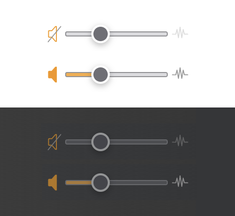
But this is not all, yet: we may actually apply and/or modify more than just a single rule in a single call of replace() or replaceSync(). Which is especially usefull to us, as we want to apply a standard style for a light color scheme and an alternative one for a dark color scheme (activated by applying a class “dark” to the body element):
// apply both rules at once
soundVolumeCSS.replaceSync(
    'input#soundCbxOnOff:checked + input[type="range"]::-webkit-slider-runnable-track {' +
      'background: linear-gradient(to right, #F7C00C ' + percentage + '%,' +
      '#D1D1D5 ' + percentage + '%);' +
    '}' +
    'body.dark input#soundCbxOnOff:checked + input[type="range"]::-webkit-slider-runnable-track {' +
      'background: linear-gradient(to right, #CA8935 ' + percentage + '%,' +
      '#535458 ' + percentage + '%);' +
    '}'
);
As a notable bonus, this implementation works also with Safari (which hasn’t participated in the range-input-accent-color rage, as of the time of writing this).
The rest is just about defining background and border colors for the dark theme in conventional CSS, which is left to the imagination of the reader.
However, there’s still a problem left, because a linear-gradient is strictly defined in a specific direction, either by an angle or a given corner or border. Notably, these corner and border values are directional, as well, as in left, right, top, bottom. There are no semantic values, like start or end. Meaning, this will be spefic to an implementations and its directional context, and we’ll have to implement individual rules for any other contexts. This is somewhat lessened by the fact that we’ll have to implement a CSS rule for each individual slider, anyways, as this solution ties the value of an individual element to a global rule. Nonetheless, it may be worth pointing out.
Now, with a bit effort, we may also fix any of the weird standard behavior by an implementation of our own.
E.g., the centered slider from our above example (working implementation):
| −96 | 0 | +96 |
One Last Thing
Before we close, yet another thing: I decided to try selling the matrix printer emulation just a tick better than by just popping up the result:
And that’s actually all, for this time…
Norbert Landsteiner,
Vienna, 2023-09-28)