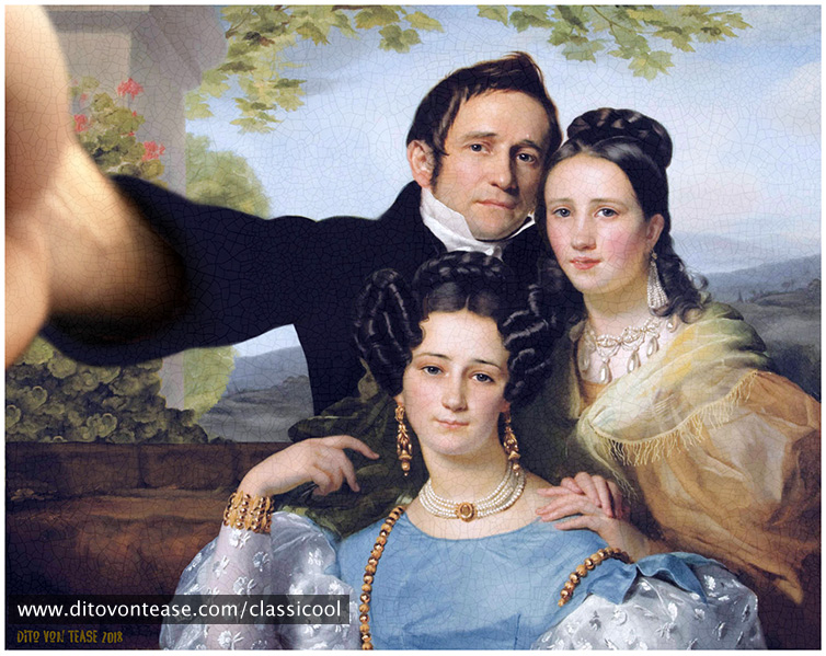
Portraits have always been a means of self-celebration and display, both of figure and social status, but also a means of reading – not only of physiognomy, but also of the essence of a person. By the democratization of photography and increasing accessibility of technological tools the portrait in its current form of the selfie hasn’t only become ultimately linked to narcissism, but has also become a means of linking over social networks and accumulating symbolic wealth on the respective status page, the new symbolic home.
Image: Dito von Tease, 2018.
Dito von Tease, a Bologna (Italy) based digital artist, has ingeniously mixed the two forms, the traditional portrait and the selfie, “showing subjects [of traditional art] in authentic and modern selfie poses. An iconoclastic project that blends together two apparently heterogeneous aesthetics, creating an ironic and surprising result.”
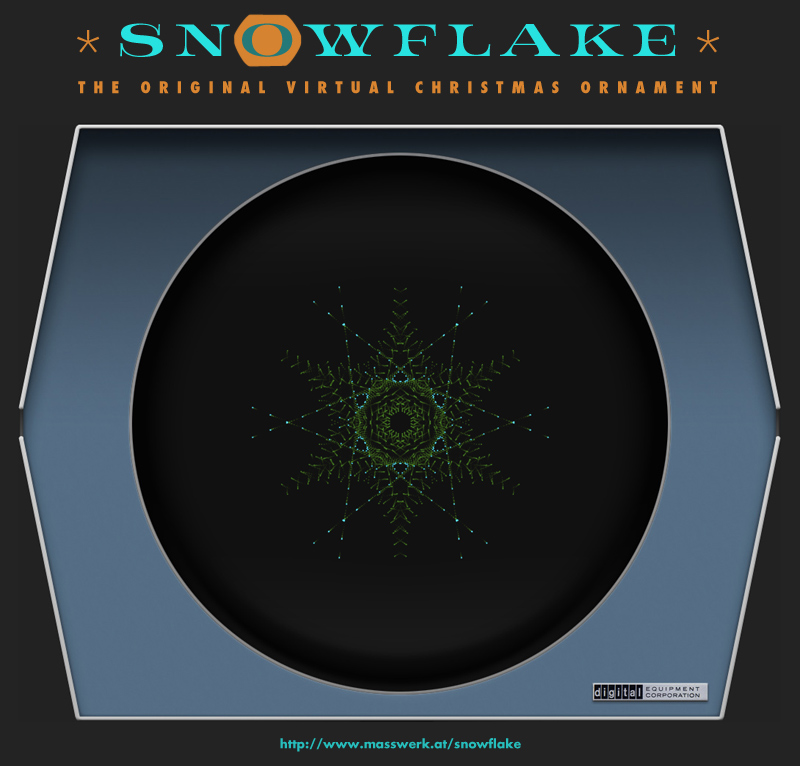
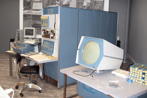
It may be just the right season to remind of one of the first computer animations, “Snowflake” written in the 1960s for the DEC PDP-1. Despite various research efforts, the author of this amazing little program remains still unknown, which is quite a bity, since s/he deserves to be rembered along with the program.
Observations on information spread and authenticity of well-known objects on the Internet. (Also, a visual whodunit. And a new reference image.)
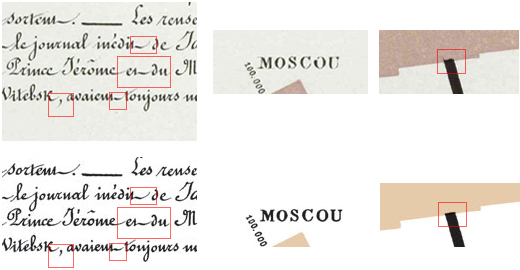
When I was recently reviewing various versions of image files representing Charles Joseph Minard’s famous chart of Napoleon’s Russian Campaign of 1812-1813 from 1869 for my discussion of the subject (see below), I noticed something peculiar: While there are various scans of the graphic available on the Web, in varying resolution and compression quality, almost all of them seem to depict a single, uniform object. However, there are just a few exceptions. Notably, these exception differ in the weight of the black print, especially the stroke widths of any black lines and by this the overall balance, and color. Most notably, these few exceptions can be traced back to just two authentic sources, both official image from French libraries. Something peculiar seems to be going here. — Time to investigate…
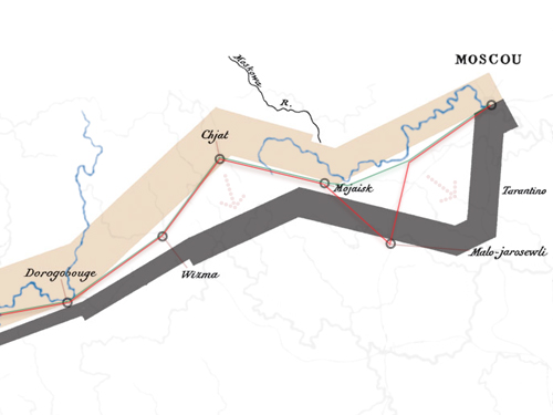
Observations on textual strategy in infographics by the example of the “Greatest Infographic of All Times”.
In November 1869, at age 88, a year short before his death in October 1870, Charles Joseph Minard published a sheet with two graphs, one of them titled “Carte Figurative des pertes succesives en hommes de l’Armée Française dans la campagne de Russie 1812-1813”, commonly known as “Napoleon‘s March on Moscow”. It is this final work of the French master of statistics and visualization, which survived in collective memory still to the present day, about 150 years later, which is probably much like it was intended by its author. Thanks to authorities of the field, like Howard Wainer and Edward Tufte, who suggested that this “may be well the best graphic ever produced”, Minard’s March on Moscow enjoys an even inreasing popularity, with Tufte’s careful suggestion soon becoming the trope of “the greatest infographic of all times”. — But, is it?
Recently, I returned my interest to Spacewar!, the first digital video game, particularly to differences between early versions, like Spacewar 2B, and the better known, later versions, like 3.1 and thereafter. One of these differences, particularly of interest here, is in the random number generator, implemented by a macro named "random" (what else?).
After just 19 years, I got a new website! The old, now retired one had been in charge since 1999. It held up pretty well for a number of years and then various attempts to a redesign met appeals for preserving the design for historic reasons, so it was somewhat under preservation order. However, times change and so do objective demands…
So what has changed in the past 19 years? Not so much for design principles itself, especially, since in the late 1990s flat design was pretty much a thing for professional understatement, which provided a bit of timelessness. (There had been also a recent trend regarding legibility vs illegibility in visual design, but, while this was reflected by a particular design element, this wasn't much of an issue for this website.) What really changed, is the size of display pixels, text-sizes in general, and overall display dimensions.
Around the millennium, a certain minimal display size was (finally!) guarantueed, with displays promising to eventually only increase in size. Then, the standard display pixel ratio was still 72dpi. While multisync CRT displays where usually driven at a higher resolution, especially on PCs, Windows made up for it by a rather big standard display size. (In fact, websites used to size the typography down by a notch to compensate for this. As in “<font size="-1">…</font>”. But beware of Windows changing Arial from bold print to letter spaced at small text sizes!) Also, the general trend in web typography was towards a small, clear print — remember those 7 point pixel fonts used in Flash applications? In the end, this added up to a typography much too small and too faint for modern displays and reading habits, which is, why there was now an objective need for a redesign.
Moreover, and probably most prominently, displays not only became bigger, as promised, but also radically smaller, as in mobile, raising additional requirements for a wider separation of elements and touch targets. While table based layouts, if done right, where generally responsive (compare the current trend in grid layout, which is basically the same), this didn't work out well with a second, new requirement, namely accessibility. Especially, since the provisions used earlier to target handheld or accessibility related devices were depricated and have come out of use since. (Compare accessibility and handheld media selectors vs media queries and WAI-ARIA.)
Time for a new approach: The new site should meet all those requirements, and, ironically (if you do know some of my work) it does so without using JavaScript (any live bits are done in SVG and/or CSS). Also, sticking to a tradition of lean resources and fair content provision, there's no user tracking whatsoever.
While we are at it, what about a blog, a quick box of virtual index cards and assorted notes, something I was wanting to do, even before I started the original website? Sure, there are things like G+, but those public, social network oriented forums provide not the means for a medium to long text form, possibly including explanatory graphics and live content. However, G+ (as long as it is still a thing) isn’t entirely out of the picture, as I will relate to it for any discussions.